If you need to create a graph quickly, using an online tool can be incredibly beneficial. Formatting data into a chart can often be challenging, and getting the information to display how you want can be even more difficult. Sometimes, the result looks so bad that you question why you attempted it. Fortunately, numerous online graph makers are available to help solve these issues. The top graph-making software revolutionizes working with charts and graphs to visualize data. While we are accustomed to creating graphs for organizing large amounts of data and highlighting specific details, traditional methods often need more essential visualization components, which can be addressed using the best graph makers.
List Of 7 Best Graph Makers
Discover these fantastic free tools for creating stunning Graphs that we came across! They are ideal for crafting personalized info-graphs without spending a fortune. With user-friendly templates and drag-and-drop capabilities, these tools offer comprehensive support. Feel free to explore your creativity with these Graph-making options. Here is a list of best graph makers. I assure you, you won’t be let down!
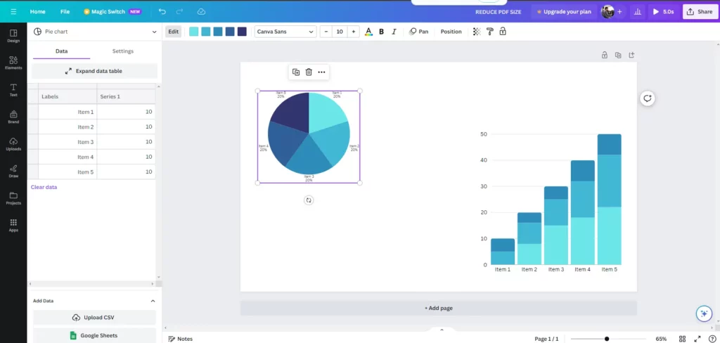
Canva is widely known for its social media images and other simple design creations, but it is also frequently utilized as a platform for creating graphs. With its intuitive and user-friendly interface, Canva makes generating professional-looking graphs and charts easy with just a few simple clicks. Whether you need to visualize data for a presentation, report, or infographic, Canva’s graph maker provides a wide range of customization options to suit your needs. From bar graphs to pie charts, line graphs to scatter plots, Canva’s graph maker empowers users to communicate their data in a visually appealing way effectively. With over 20 chart options and templates, users can easily generate straightforward graphs. These charts can be saved in PNG, JPG, or PDF formats and printed directly from web pages. Additionally, sharing with other users and uploading to social media platforms is seamless. Upon upgrading to Canva Pro, access to millions of exclusive photos, graphics, templates, and fonts becomes available.
Visme offers a platform for designing infographics akin to Canva but with enhanced charting capabilities. Within the Visme editor, users can generate fundamental graphs like bar, line, and scatter graphs. Upgrading to the premium version unlocks access to advanced charts such as funnel, radar, and area charts, along with a mapping function. It provides customization options such as color schemes, fonts, and layouts, allowing users to tailor their graphs to match their brand or presentation style. Additionally, Visme provides numerous sharing options, enabling users to distribute their infographics online and across various social media platforms like Twitter, Facebook, Pinterest, and Linkedin.
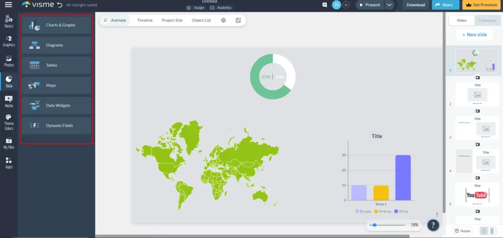
Moreover, it supports embedding infographics on websites and blogs. Notably, the free version limits output format to JPG; however, educators, students, and non-profit organizations are eligible for discounts on the paid version. Whether for business reports, academic presentations, or social media posts, Visme provides the tools to bring data to life through captivating graphs.
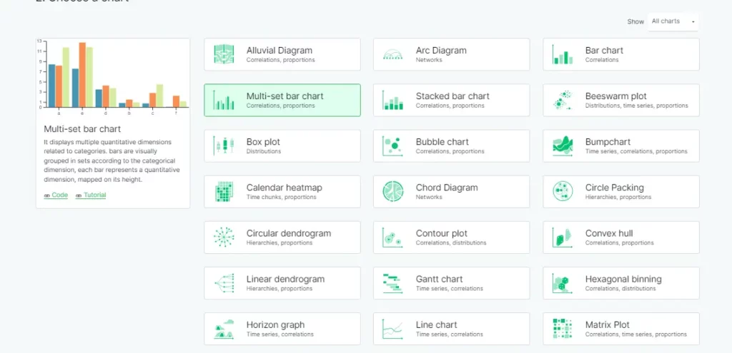
Figma, a popular design tool, can also be used as a graph maker. Creating a graph with Figma involves utilizing the shape and pen tools to plot data points and then connecting them to form the desired Graph.
To build a graph:
- Start by selecting the frame in which you want to create the Chart.
- Once you have chosen the structure, select an object from your design to use as the basis for building the Graph.
- After choosing the thing, enter the data into the table.
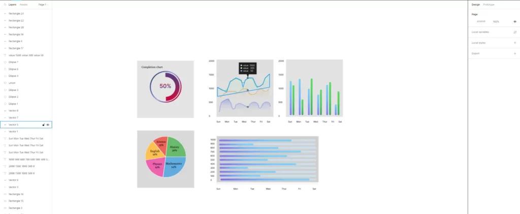
This can be done manually or by pasting data from Excel. To populate the table, you can also generate random numbers within the desired range. These steps will help you to effectively build a graph based on your chosen parameters and data sources.
However, it is important to note that Figma’s graph-making capabilities must be better suited for beginners and non-designers. The process requires a good understanding of design principles and familiarity with the tool’s features, which may make it challenging for those with design experience.
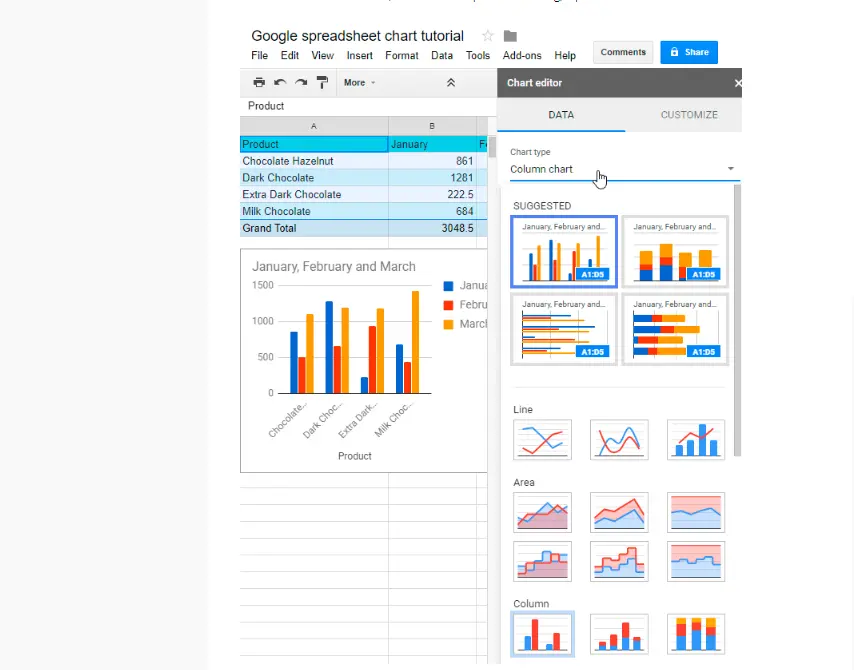
Google Sheets
Instead of transferring your data from an existing document to a graph creator, consider going directly to the source. Google Sheets, a well-known online spreadsheet service, allows you to create graphs instantly from your data.
Here is a little guide on Creating a Graph on Google Sheets. Once you have inputted your data, you can convert it into a graph or Chart for easier understanding. Fortunately, Google Sheets offers a simple process for this. With various options available, you can choose a pie chart to display parts of a whole or a bar graph to compare statistics. Follow these steps to create a graph in Google Sheets:
- Choose the cells containing the data you want to visualize.
- Click on Insert.
- Select Chart.
- Choose the type of Chart that best suits your data, such as pie charts for percentage-based data and histograms for time-based comparisons.
- Explore different chart types by clicking on Chart Types and customize the formatting by clicking Customization. 6. Finally, click Insert to add the Graph to your spreadsheet.
Piktochart is a versatile graph maker that offers various features to create visually appealing graphs. Its user-friendly interface makes it ideal for beginners and non-designers, allowing them to design professional-looking charts without extensive experience or expertise easily. To create a graph on Piktochart, users can choose from various graph templates, customize the data points and labels, and add their creative touches to enhance the visual presentation.
The platform offers many features, including editable maps, timelines, comparison templates, and lists. Users who frequently deal with tables, spreadsheets, and timelines will find Piktochart’s adaptable layouts especially beneficial as they can elegantly enhance these elements. With just a click, users can effortlessly alter the type of diagram and customize colors, fonts, sizes, and positions.
With its intuitive tools and templates, Piktochart simplifies the process of graph creation and effectively empowers users to communicate their data in a visually engaging manner. In addition to this flexibility, Piktochart seamlessly recognizes data imported directly from Excel files.
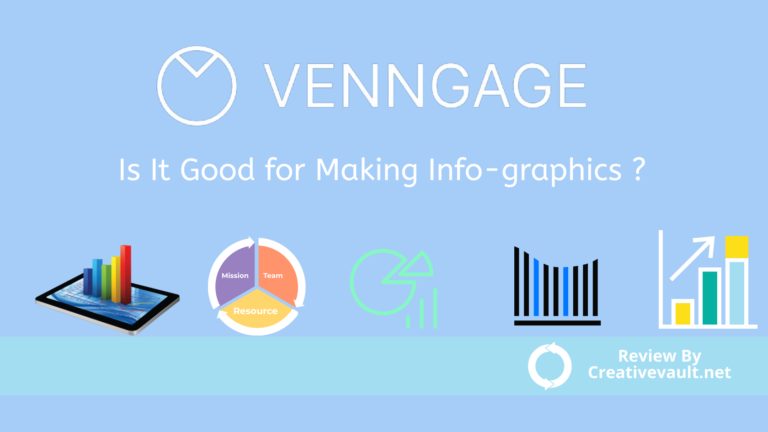
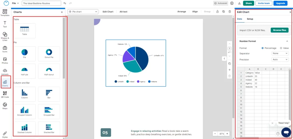
Venngage is a web-based design tool with various features for visually appealing and informative graphs. Like Piktochart, it provides a user-friendly interface ideal for new designers looking to create professional graphics. Venngage allows users to easily customize their charts with various design elements, templates, and color schemes, making it simple to create eye-catching and effective visual representations of data.
Venngage offers a simple editing process with a sidebar for choosing design elements like stock photos, charts, and icons and a top menu for Customization. Users can access a wide range of icons and pictures at no extra charge, including 23,000 creative icons and over 3 million professional stock images that can seamlessly integrate into infographics. Additionally, all templates are equipped with preloaded icons and photos, removing the necessity for separate payments for each element. With its intuitive tools and ease of use, Venngage is an excellent choice for those new to graphic design who want to create high-quality graphs.
RAWGraphs is a user-friendly data visualization tool designed to make it simple for anyone to represent intricate data visually. This application empowers individuals with no coding expertise to generate visualizations effortlessly. It caters to graphic designers and data visualization enthusiasts who work with vector graphics software and anyone seeking to create data-driven graphics. Its ability to manipulate data, color, and size makes it an ideal foundation for vector-based data visualization projects.
RAW Graph is a cost-free platform that enables users to produce graphs easily. We suggest trying it to visualize data from delimiter-separated values such as CSV and TSV files. Additionally, for those with programming knowledge, RAWGraphs offers the flexibility to choose from pre-made graphs and create highly customizable charts. It is hard to understand the platform, so we don’t recommend it to non-designers and beginners.
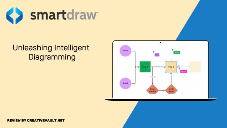
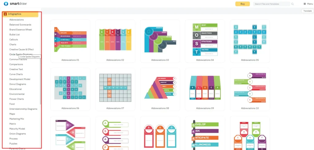
SmartDraw
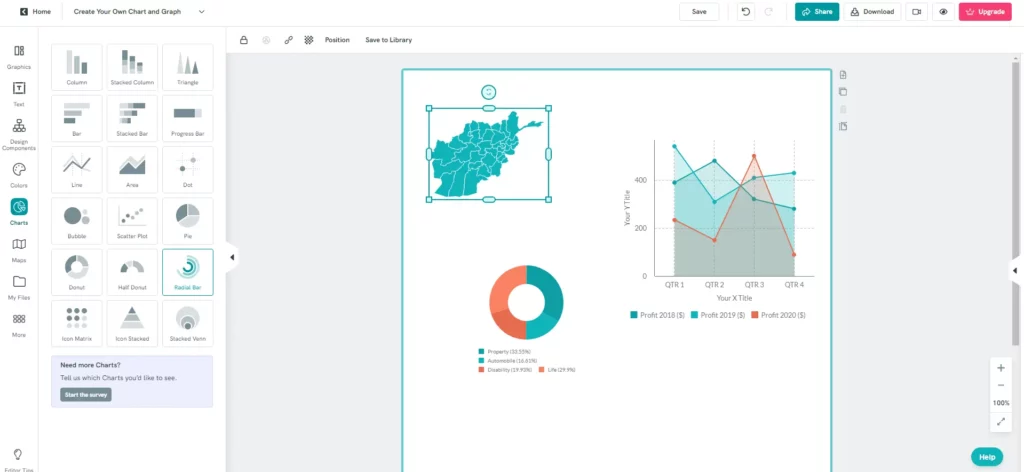
SmartDraw is a top-notch tool for creating graphs, enabling users to easily generate various graphs and charts. This adaptable software streamlines the graphing process with its user-friendly interface and an extensive library of templates. SmartDraw provides a comprehensive array of choices, whether it’s bar graphs, line charts, pie charts, or organizational charts. Users can effortlessly input their data, customize visuals, and produce polished graphs suitable for presentations, reports, or educational materials. With its user-friendly design and automation capabilities, SmartDraw is an invaluable resource for individuals and businesses needing an efficient graph creation and data visualization solution.
Tips and Tricks to Make Your Charts More Understandable
To make your charts more understandable, choosing the right type of Chart for the data you want to present is important. For example:
- Use bar charts for comparing different categories or trends over time, while pie charts are best for showing proportions and percentages.
- It’s also crucial to keep your Chart design simple and uncluttered, with clear labels and titles.
- Utilize color strategically to highlight key points, but avoid using too many colors that can confuse the viewer.
- Use animations, but do just what is necessary.
- Order data logically and provide space in essential places.
- Always choose a simple text style and avoid unnecessary openings.
- Highlight the data you are talking about, an axis value or range, and Display additional information effectively.
Providing context and explanations for the data in the Chart can also enhance understanding and utilize annotations or callouts to draw attention to specific details. Finally, always consider your audience and what information they need from the Chart – this will help you tailor your visualizations for maximum clarity and impact.
Final Thoughts
In conclusion, graphs are vital in engaging audiences by presenting data and information in a visually appealing and easy-to-understand format. The availability of graph-making tools further enhances this process by providing user-friendly platforms to create, customize, and share graphs with ease. A vast array of graph-making tools are at your disposal. Upon perusing this article, I trust that you will locate the perfect one to suit your needs. Graph makers play a crucial role in visualizing data enhancing its accessibility and comprehensibility.
While these tools are well-suited for beginners and non-designers due to their flexibility and functionality, they must explore different options to determine which device best fits their needs. Ultimately, graph-making tools empower individuals to effectively communicate complex data and concepts, making it crucial for professionals across various industries to leverage these resources for impactful presentations and decision-making processes.
I hope you like the Blog post, about the Best Graph Makers and we will be back with more informative and creative content soon.